


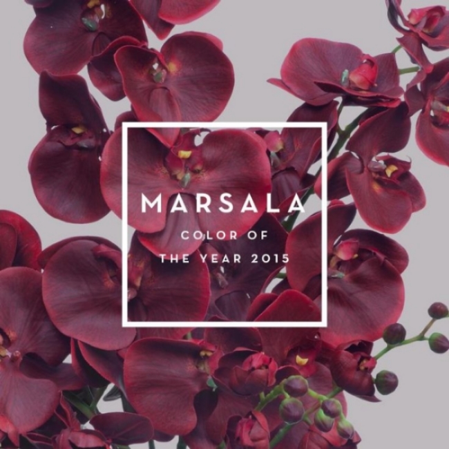
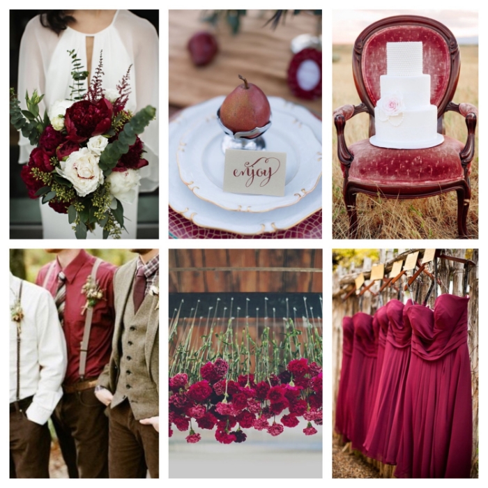
The verdict is out, Pantone’s color of the year is Marsala. I have to admit, I wasn’t initially wowed by the choice. But after sourcing the web for inspiration, I can see how this color can be incorporated into a current design style. With it’s earthy brownish burgundy tone, this neutral and stable color can act as a base for your next design inspiration. It can definitely be incorporated into a Fall/Winter wedding or event decor. With it’s neutral base, this color can go in any design direction from Rustic to Modern to Whimsical, the key is to infuse the color with other complimentary colors in your particular style in order to keep it from looking drab (…bringing this adjective back) and boring. For a Rustic style, pairing this color with other woodsy colors like tan or mahogany will really drive home that organic feel. For a more Modern style, pairing this tone with minimalist shapes and textures can create that feel and for a Whimsical look the bolder the better. Bright colors and unconventional decor would strengthen a Whimsical look. So give it a try and let us know what you think.
Be the first to comment.